 ColorHexHub Design Team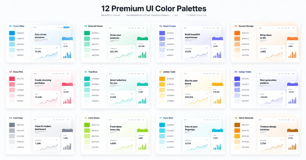
Choosing the right colors can completely change how users feel about your website or app.
Think about brands like Stripe, Notion, Spotify, or Linear. Their interfaces don't just look attractive—they feel consistent, trustworthy, and easy to use. Much of that experience comes from carefully selected color palettes.
A great UI palette isn't about using as many colors as possible. It's about choosing a small set of colors that work together, create visual hierarchy, and improve usability.
In this guide, we'll explore some of the best UI color palettes for websites, SaaS dashboards, and mobile apps. You'll also learn how to choose colors that improve readability, accessibility, and user experience.
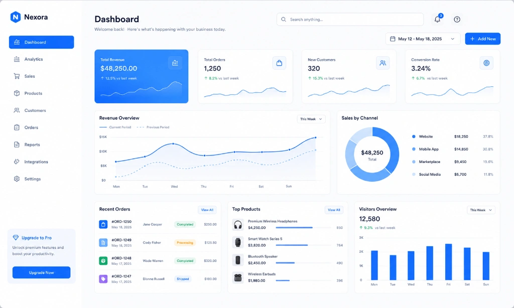
What Makes a Good UI Color Palette? #
A well-designed palette should:
- Build trust: Harmonious colors evoke confidence and professionalism.
- Improve readability: High contrast between text and background prevents eye strain.
- Highlight important actions: Distinct primary and accent colors draw immediate attention to key conversion points.
- Support accessibility: Colors should meet WCAG guidelines so all users, including those with visual impairments, can navigate comfortably.
- Stay consistent across the entire product: Standardized tokens across pages and components create a cohesive experience.
Instead of picking random colors, define clear roles:
- Primary: The dominant brand color used for key interactive elements like main action buttons.
- Secondary: Supporting color for secondary buttons, filters, and complementary UI badges.
- Accent: High-energy color used sparingly for active states, highlights, and notification indicators.
- Background: The base color of the page canvas (usually light gray or soft neutral).
- Surface: Background color for containers, cards, dialogs, and navigation bars (often pure white or elevated gray).
- Text: High-contrast colors for headings, body copy, and secondary descriptions.
- Success: Semantic green color indicating completed actions or positive status metrics.
- Warning: Semantic amber or orange color signaling non-critical warnings or pending states.
- Error: Semantic red color indicating validation errors, failed requests, or dangerous actions.
12 Modern UI Color Palettes #
Here are 12 production-ready color palettes designed for websites, SaaS dashboards, and mobile applications:
1. SaaS Blue #
The timeless standard for B2B SaaS platforms, enterprise tools, and cloud services. Communicates reliability, security, and clarity.
Primary
#2563EBAccent
#60A5FABackground
#F8FAFC2. Emerald Green #
Ideal for fintech, sustainability, health apps, and growth analytics dashboards. Green conveys financial prosperity, vitality, and safety.
Primary
#10B981Accent
#34D399Background
#F0FDF43. Purple Gradient #
A modern aesthetic favored by AI startups, creative tools, and Web3 applications. Delivers an innovative, high-tech, and futuristic impression.
Primary
#7C3AEDAccent
#A855F7Background
#FAF5FF4. Sunset Orange #
Warm, energetic, and engaging. Excellent for e-commerce, creator platforms, food delivery, and conversion-focused landing pages.
Primary
#F97316Accent
#FB923CBackground
#FFF7ED5. Modern Dark #
A sleek dark mode palette designed for developer tools, code editors, design applications, and night-time usage.
Primary
#0F172AAccent
#3B82F6Background
#0206176. Rose Pink #
Vibrant, stylish, and playful. Great for lifestyle apps, social platforms, beauty products, and modern creative agencies.
Primary
#F43F5EAccent
#FB7185Background
#FFF1F27. Teal Blue #
Refreshing, clean, and balanced. Perfect for healthcare dashboards, wellness platforms, and modern SaaS tools requiring calm focus.
Primary
#14B8A6Accent
#2DD4BFBackground
#F0FDFA8. Amber Gold #
Prestigious, warm, and sophisticated. Highly suitable for wealth management, reward programs, real estate, and premium memberships.
Primary
#F59E0BAccent
#FBBF24Background
#FFFBEB9. Indigo Violet #
Deep, tech-focused, and elegant. Popular among developer portals, API documentation platforms, and modern analytics suites.
Primary
#4F46E5Accent
#6366F1Background
#EEF2FF10. Cool Gray #
Minimalist, structured, and neutral. Perfect for content-heavy sites, documentation portals, and editorial platforms where content takes priority.
Primary
#334155Accent
#64748BBackground
#F8FAFC11. Cyan Blue #
Bright, crisp, and high-energy. Designed for cloud platforms, communication apps, and modern digital productivity suites.
Primary
#06B6D4Accent
#22D3EEBackground
#ECFEFF12. Warm Neutrals #
Organic, earthy, and welcoming. Ideal for architectural portfolios, craft commerce, hospitality, and artisan brand landing pages.
Primary
#EA580CAccent
#F97316Background
#FFF7ED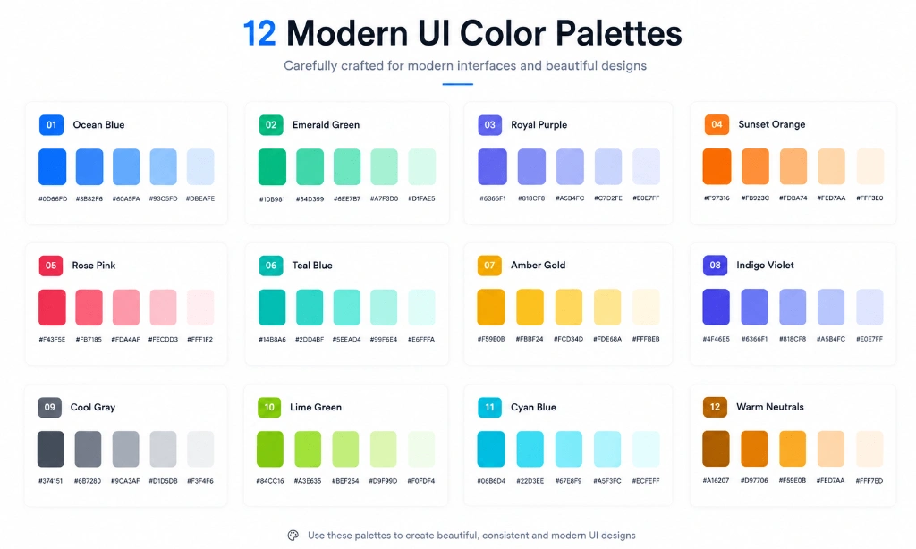
Where to Use Different Colors #
To maintain clarity and prevent visual clutter, assign each color role to specific UI components:
| Element | Recommended Color | Purpose & Best Practices |
|---|---|---|
| Primary Button | Brand Color (#2563EB) | High-priority primary Call to Action (CTA) |
| Secondary Button | Neutral (#F1F5F9 / #475569) | Ghost or outlined buttons for secondary choices |
| Success Message | Green (#10B981) | Confirmation alerts, toast notifications, status badges |
| Warning | Amber (#F59E0B) | Non-destructive alerts, rate limit notices, trial warnings |
| Error | Red (#EF4444) | Form field validation errors, destructive action dialogs |
| Links | Blue (#2563EB) | Inline text hyper-links with visible underline hover states |
| Background | Light Neutral (#F8FAFC) | Page canvas base to reduce eye glare |
| Cards & Modals | White (#FFFFFF) | Elevated surface containers with subtle border shadows |
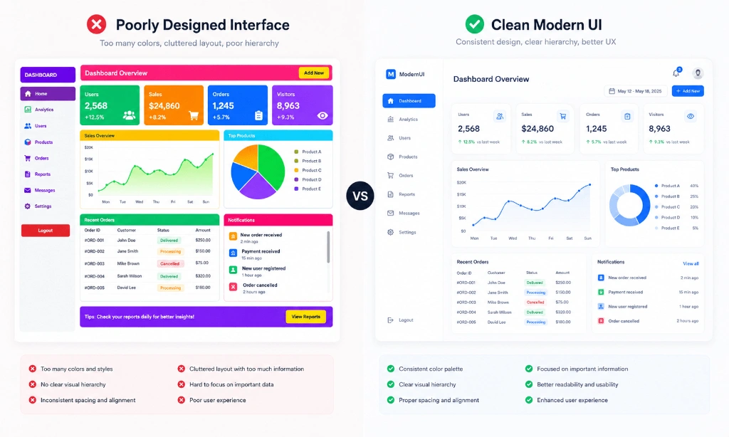
Common Mistakes to Avoid #
When building your product's design system, watch out for these common color pitfalls:
- Too many bright colors: Using multiple vibrant colors competes for user attention and creates cognitive fatigue.
- Low text contrast: Light gray text on white cards breaks WCAG contrast compliance and makes text unreadable.
- Inconsistent button colors: Switching primary button colors across screens confuses users about what is clickable.
- Pure black backgrounds:
#000000creates severe visual contrast against bright text. Dark slate grays like#020617or#0F172Aoffer far smoother reading experiences. - Using red and green together without accessibility checks: Color-blind users (deuteranopia/protanopia) struggle to distinguish red and green. Always pair color cues with icons or text labels.
Accessibility Tips for UI Colors #
- Maintain sufficient contrast: Ensure body text achieves at least a 4.5:1 contrast ratio against its background (3:1 for large headings) to meet WCAG AA standards.
- Don't rely only on color: Pair color indicators with clear icons, checkmarks, or status text so information is accessible to color-blind users.
- Test palettes in light and dark themes: Ensure your color tokens dynamically adapt without losing visual hierarchy or contrast.
- Use semantic colors consistently: Keep success, warning, and error colors uniform across all web pages and mobile app screens.
Frequently Asked Questions #
How many colors should a UI palette have? #
Most interfaces work well with 5–8 core colors, including 1 primary brand color, 1–2 secondary/accent shades, 3–4 neutral gray scale tokens, and standard semantic colors (green, amber, red).
Which color is best for SaaS products? #
Blue is widely used because it conveys trust, stability, and professionalism. However, green, purple, and dark mode palettes can also work exceptionally well depending on your product niche.
Can I use gradients in UI design? #
Yes. Subtle linear gradients work well for hero section backgrounds, banner illustrations, and brand cards. However, avoid overusing gradients on functional UI components like buttons or input fields.
Should I use pure black? #
Not usually. Pure black (#000000) creates harsh contrast against white text, leading to eye strain. Dark gray tones such as #020617 or #0F172A provide a smoother, more comfortable user experience.
How do I test accessibility? #
Use an online WCAG contrast checker tool to verify that your foreground text and background color pairs meet 4.5:1 contrast ratios.
Related Tools #
- Color Palette Generator – Generate harmonized 5-color UI palettes using mathematical rules.
- Contrast Checker – Verify WCAG 2.1 contrast compliance for text and UI components.
- Gradient Generator – Create smooth CSS linear and radial gradients.
- Color Picker – Pick colors visually and extract RGB, HEX, and HSL tokens.
- HEX to RGB Converter – Instantly convert HEX color codes to RGB values.
Related Articles #
- What Is a HEX Color? – Learn how 6-digit hexadecimal codes work in CSS and digital design.
- What Is RGB Color? – Understand additive light channels and RGB values for digital screens.
- HSL vs HSV – Discover how cylindrical color models work for UI design systems.
- CSS Color Names – Complete reference guide to 148 named CSS color keywords.
- RGB vs CMYK – Learn the key differences between digital screen colors and print inks.
Conclusion #
A thoughtfully designed color palette does more than make an interface attractive—it improves usability, strengthens your brand, and helps users navigate your product with confidence.
Start with a small, consistent palette, test it for accessibility, and refine it as your design system grows.