 ColorHexHub Design Team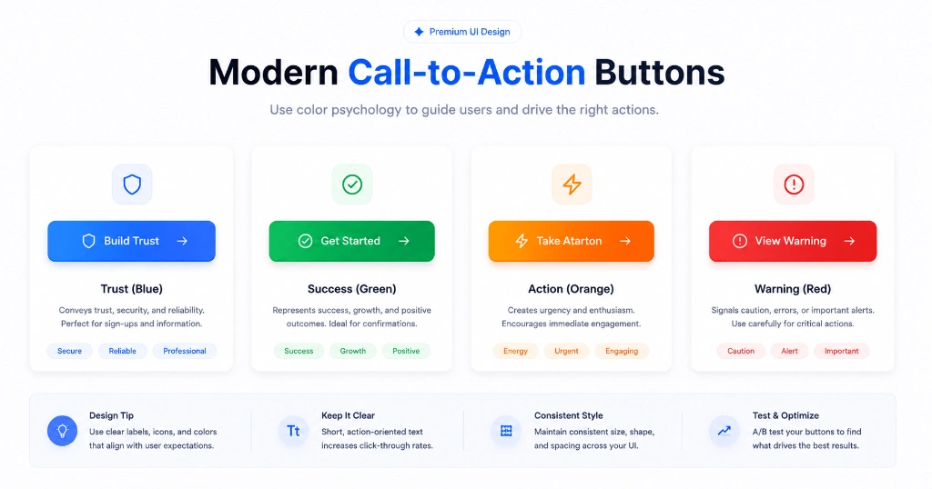
Imagine you're shopping online.
You add a product to your cart, reach the checkout page, and see two buttons:
One is a bright blue "Complete Purchase" button.
The other is a dull gray button with the same text.
Even though both buttons do exactly the same thing, most people instinctively click the blue one.
That's the power of color.
Buttons are often the most important interactive elements on a website. They guide visitors, encourage actions, and help users move through your interface. Choosing the wrong button color can make important actions easy to miss, while the right color naturally attracts attention without feeling aggressive.
Why Button Colors Influence User Behavior #
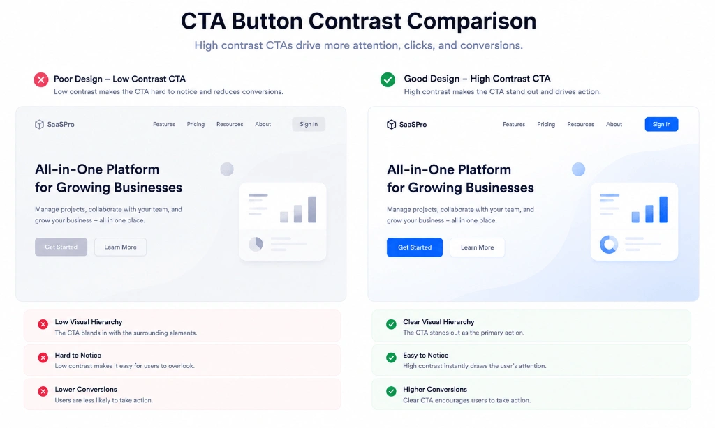
People notice contrast before they notice text.
If your page uses mostly neutral colors, a single vibrant button immediately stands out.
That's why many successful products keep the rest of the interface calm and allow primary actions to attract attention naturally.
The goal isn't to make the button louder.
It's to make it easier to find.
Understanding Button Color Psychology #
Blue Buttons Build Trust #
Blue is one of the most popular button colors in software. Companies like Facebook, LinkedIn, Stripe, and many SaaS platforms use blue because it feels reliable, professional, and calm.
Typical uses:
- Login & Sign Up
- Continue / Next Step
- Save Changes
- Submit Application
Recommended HEX:
#2563EBGreen Buttons Suggest Success #
Green naturally communicates positive outcomes, growth, and confirmation.
Typical uses:
- Payment & Checkout Success
- Download File
- Confirm Order
- Complete Task
Recommended HEX:
#10B981Orange Buttons Create Energy #
Orange attracts attention without feeling as aggressive as red. It conveys enthusiasm, urgency, and friendliness.
Typical uses:
- Start Free Trial
- Get Started Now
- Claim Limited Offer
- Upgrade Account
Recommended HEX:
#F97316Red Buttons Need Care #
Red immediately signals urgency and danger. Using red for every primary button can increase anxiety and reduce trust.
Reserve red for destructive actions:
- Delete Account
- Remove Item
- Cancel Subscription
- Discard Draft
Recommended HEX:
#EF4444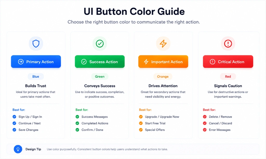
Contrast Is More Important Than Color #
Many designers spend hours choosing between blue and purple but forget the real issue:
Can users actually see the button?
A blue button on a blue background won't perform well, no matter how beautiful the color is.
Before launching a design:
- Check text contrast: Ensure text inside the button has at least a 4.5:1 ratio against the button background.
- Test buttons on mobile: Verify button tap targets are at least 44x44 pixels.
- Verify hover & active states: Ensure visual feedback occurs when users hover or click.
- Ensure visibility in dark mode: Test button contrast in both light and dark themes.
Real Examples from Top Products #
Stripe #
Uses clean blue primary buttons while keeping the surrounding dashboard background neutral white and slate gray.
Notion #
Uses subtle neutral buttons for general navigation and introduces stronger primary colors only when confirming key actions.
Spotify #
Uses its signature vibrant green (#1DB954) sparingly on play and upgrade buttons so key actions stand out immediately.
Notice a pattern? Successful products don't fill every screen with colorful buttons. They create contrast through restraint.
Common Mistakes to Avoid #
❌ Every button uses a different color: Creates cognitive clutter and confuses users.
❌ Low contrast between text and button background: Fails accessibility standards.
❌ Red used for positive actions: Triggers accidental user anxiety.
❌ Tiny buttons with little padding: Hard to tap on mobile devices.
❌ No hover or focus state: Keyboard and mouse users get no interactive feedback.
Accessibility Tips for CTA Buttons #
Good button design isn't only about appearance:
- Text contrast: Ensure button text meets WCAG 2.1 AA contrast standards.
- Tap targets: Make buttons large enough (min 44px height) to tap comfortably on mobile screens.
- Focus rings: Provide clear keyboard focus outlines (
outline-2 outline-blue-500) for accessibility. - Don't rely only on color: Use clear text labels (e.g. "Delete Account" rather than just a red box) so color-blind users know the action.
Frequently Asked Questions #
Which button color converts best? #
There's no universal winner. Context, contrast, and usability have a much bigger impact than the color itself.
Should primary buttons always be blue? #
No. Use the color that best matches your brand while maintaining strong visibility against your interface background.
Can I use gradients on buttons? #
Yes, but keep them subtle and consistent across your design system.
Should destructive buttons be red? #
Yes. Red is widely recognized for actions that can't easily be undone, like deleting data or canceling accounts.
How many button colors should a design system have? #
Most interfaces work well with one primary button color, one secondary neutral style, and one destructive red style.
Related Tools #
- Contrast Checker – Verify WCAG 2.1 contrast compliance for CTA buttons.
- Color Palette Generator – Generate harmonized primary and secondary CTA button colors.
- Gradient Generator – Create smooth CSS linear gradients for modern buttons.
- Color Picker – Pick CTA colors and extract HEX, RGB, and HSL tokens.
Related Articles #
- Best UI Color Palettes – Discover 12 modern color combinations for SaaS & mobile apps.
- Dark Mode Design – Learn 12 best practices for designing dark interfaces.
- CSS Color Names – Complete guide to CSS color keywords and values.
- What Is a HEX Color? – Learn how 6-digit hexadecimal codes work in CSS.
Conclusion #
Choosing a button color isn't about following trends—it's about helping users take the next step with confidence.
A well-designed interface uses color intentionally. Primary actions stand out, destructive actions are clearly communicated, and every button feels like part of a consistent design system.
If you're ever unsure which color to use, start with clarity rather than creativity. A simple, accessible button will almost always outperform a flashy one that confuses users.