 ColorHexHub Design Team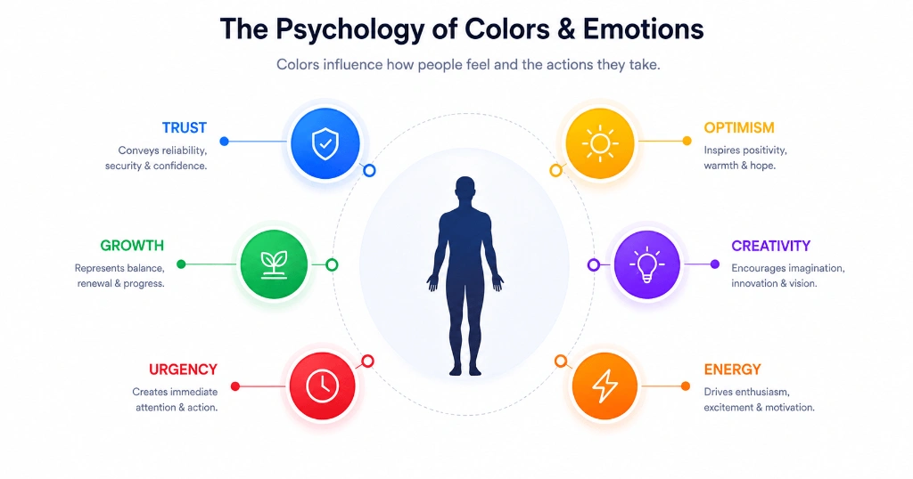
Have you ever wondered why so many banks use blue in their logos? Or why "Buy Now" buttons are often green or orange instead of gray?
It isn't a coincidence.
Every day, we make hundreds of decisions without realizing how much color influences us. Whether we're shopping online, scrolling through social media, or choosing between two products, colors quietly shape our first impressions.
That doesn't mean every person reacts to color in exactly the same way. Culture, personal experiences, and context all play a role. But certain patterns appear often enough that designers, marketers, and brands pay close attention to them.
Understanding color psychology won't magically increase sales overnight, but it will help you make more thoughtful design choices.
Why Color Is Often the First Thing We Notice #
Before someone reads a headline or clicks a button, they notice color.
That's because our brains process visual information incredibly quickly. A familiar color can create an instant impression long before we start reading.
Think about the last time you visited a website. You probably noticed whether it felt modern, playful, luxurious, or professional within seconds.
Color is one of the biggest reasons for that first impression.
What Different Colors Commonly Represent #
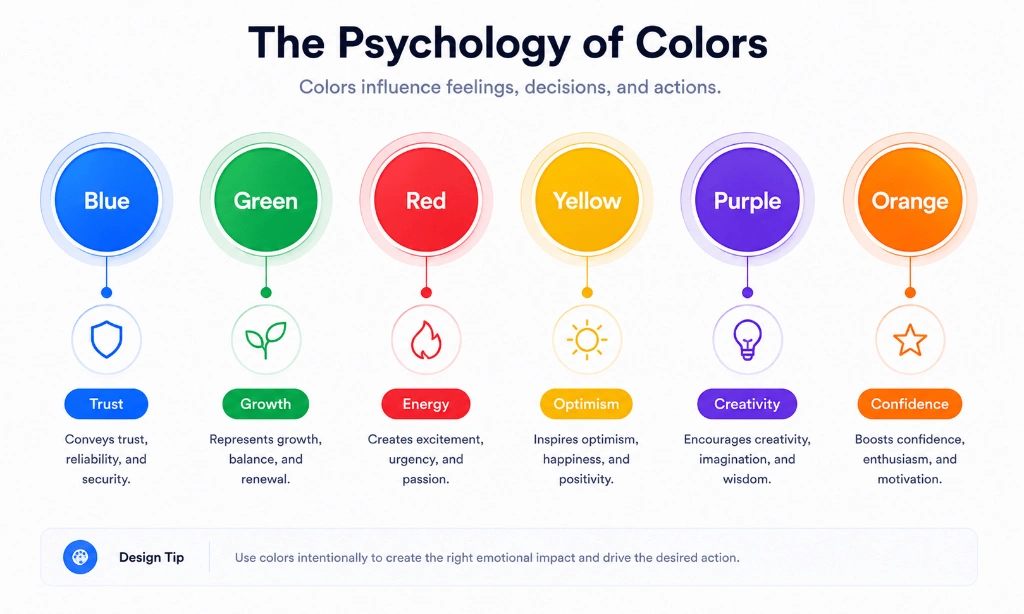
🔵 Blue – Trust and Stability #
Blue is one of the most widely used colors in technology, healthcare, and finance.
- Core Feelings: Trust, reliability, security, professionalism, calmness.
- Popular Applications: Software platforms (Stripe, LinkedIn, Twitter), banks, healthcare platforms.
- Recommended HEX:
#2563EB
🟢 Green – Growth and Success #
Green is strongly associated with nature, health, prosperity, and positive outcomes.
- Core Feelings: Growth, balance, vitality, renewal, financial prosperity.
- Popular Applications: Success messages, finance apps, sustainability, organic products.
- Recommended HEX:
#10B981
🔴 Red – Energy and Urgency #
Red grabs attention quickly and increases heart rate.
- Core Feelings: Energy, passion, urgency, excitement, warning.
- Popular Applications: Limited-time offers, clearance sales, error notifications, fast food.
- Recommended HEX:
#EF4444
🟡 Yellow – Optimism and Attention #
Yellow feels bright, warm, and energetic.
- Core Feelings: Optimism, warmth, happiness, caution, friendliness.
- Popular Applications: Feature highlights, warning badges, youth brands, icons.
- Recommended HEX:
#F59E0B
🟣 Purple – Creativity and Luxury #
Purple is commonly associated with wisdom, mystery, and premium quality.
- Core Feelings: Innovation, imagination, luxury, royalty, creativity.
- Popular Applications: Creative software (Figma), AI tools, beauty products, premium memberships.
- Recommended HEX:
#8B5CF6
🟠 Orange – Energy and Enthusiasm #
Orange combines the urgency of red with the cheerfulness of yellow.
- Core Feelings: Energy, enthusiasm, warmth, friendliness, motivation.
- Popular Applications: Call-to-action buttons, sports brands, promotional banners, food apps.
- Recommended HEX:
#F97316
Does Color Psychology Always Work? #
Not exactly.
Color psychology isn't a universal rulebook.
A color that represents celebration in one culture may have a completely different meaning somewhere else.
The product itself also matters.
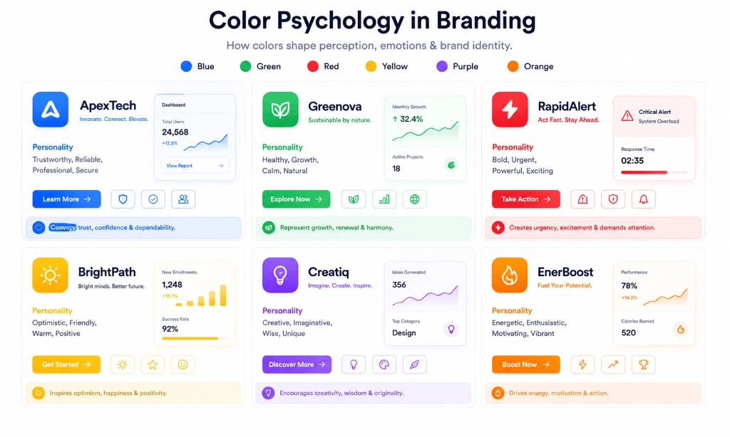
A children's learning app and a cybersecurity platform shouldn't use the exact same palette simply because a color is considered "trustworthy."
Good design always considers audience, context, and usability together.
How to Apply Color Psychology to Your Brand #
Rather than copying another company's palette, ask yourself:
- Does this color fit my target audience?
- Does it support my brand personality?
- Will it remain readable and accessible?
- Does it guide users toward the right action?
Those questions matter far more than chasing fleeting design trends.
Common Mistakes to Avoid #
- Choosing colors based only on personal preference: Design for your users, not just your personal taste.
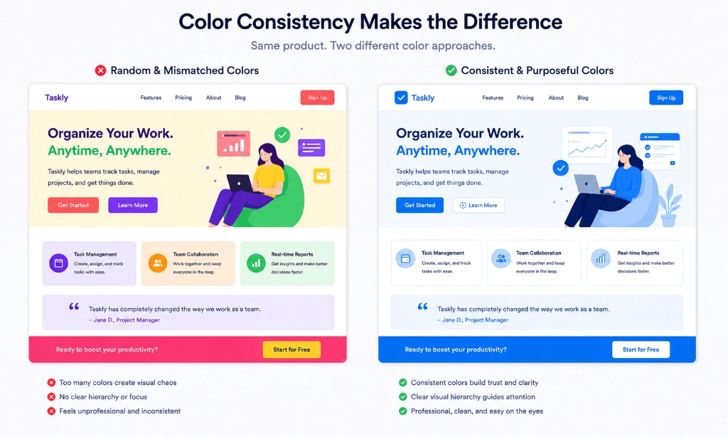
- Using too many bright colors at once: Overpowers users and creates visual chaos.
- Ignoring accessibility and contrast: High contrast ensures all users can read your content comfortably.
- Following trends without considering the audience: Short-lived trends may erode long-term brand equity.
- Changing brand colors too frequently: Causes confusion and weakens brand recognition.
Frequently Asked Questions #
Is color psychology scientifically proven? #
Research suggests colors can influence perception and emotions, but responses also depend on culture, context, and individual experience.
Which color builds the most trust? #
Blue is commonly associated with trust and reliability, which is why it's widely used in technology and finance.
Is red always the best color for sales? #
Not necessarily. Red creates urgency, but overusing it can make users feel pressured or anxious.
Can one color work for every brand? #
No. The best color depends on your audience, product niche, and brand personality.
Should I follow color trends? #
Trends can inspire ideas, but timeless, accessible color systems usually perform better over the long term.
Related Tools #
- Color Palette Generator – Generate harmonized 5-color palettes based on color psychology.
- Color Picker – Pick colors visually and extract RGB, HEX, and HSL tokens.
- Contrast Checker – Verify WCAG 2.1 contrast compliance for brand colors.
- Gradient Generator – Create smooth CSS linear and radial gradients.
Related Articles #
- Best UI Color Palettes – Discover 12 modern color combinations for SaaS & mobile apps.
- Button Color Psychology – Learn how button colors drive user actions.
- What Is a HEX Color? – Learn how 6-digit hexadecimal codes work in CSS.
- CSS Color Names – Complete guide to 148 named CSS color keywords.
Conclusion #
Color psychology isn't about finding a magical color that guarantees success. It's about understanding how people perceive visual information and using that knowledge responsibly.
The strongest brands don't choose colors by accident. They build consistent systems that support their message, improve usability, and create memorable experiences.
When you're selecting colors for your next website, app, or brand, don't ask, "What's the most popular color?" Ask, "What feeling do I want people to have?" That's where better design begins.