 ColorHexHub Design Team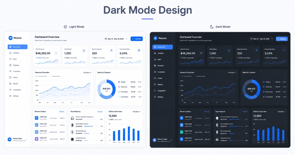
A few years ago, adding a dark mode to an app felt like a bonus feature.
Today, people expect it.
Whether you're opening YouTube late at night, replying to messages on WhatsApp, or managing tasks in Notion, chances are you'll switch to dark mode without even thinking about it. It's become part of how many of us use technology every day.
But here's something that often surprises beginners:
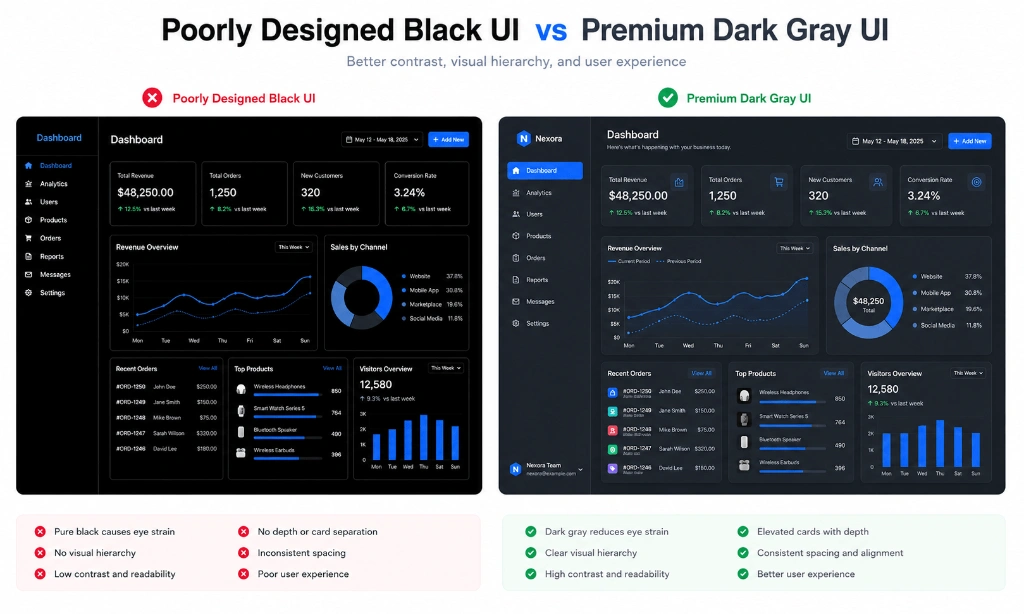
Designing a good dark interface isn't as simple as changing white backgrounds to black.
In fact, that's one of the fastest ways to make an interface look cheap.
The best dark mode designs are carefully balanced. They reduce eye strain, create visual depth, and make important elements stand out without overwhelming the user.
Let's look at what actually makes a dark interface feel modern and comfortable.
Why Dark Mode Became So Popular #
Dark mode isn't just about aesthetics.
Many people prefer it because it's comfortable to use in low-light environments. Others simply like the modern, sleek look.
For OLED displays, darker interfaces can also help reduce power consumption, although the savings depend on how the app is designed.
More importantly, users now expect to have a choice.
If your product offers only a light theme while competitors provide both, it may feel outdated.
12 Dark Mode Design Best Practices #
Here are 12 essential principles to build professional, accessible dark mode interfaces:
1. Avoid Pure Black (`#000000`) Backgrounds #
Filling your canvas with #000000 creates harsh contrast against white text, causing visual vibration and eye fatigue. Use dark slate grays like #0F172A, #111827, or #1E293B instead.
2. Use Layered Surfaces to Express Depth #
In light mode, drop shadows express elevation. In dark mode, shadows disappear. Express elevation by making higher surface layers progressively lighter (e.g., base #090D16, cards #131C2E, modals #1E293B).
3. Desaturate Accent & Brand Colors #
High-saturation colors (like bright neon blue #0000FF) vibrate intensely on dark canvases. Desaturate your accent palette slightly to maintain comfortable legibility.
4. Establish Distinct Typography Contrast Ratios #
Avoid using pure white (#FFFFFF) for all text. Use tiered opacity levels:
- Primary Headings: High-contrast off-white (
#F9FAFBor 95% white opacity). - Body Copy: Medium-contrast gray (
#E5E7EBor 80% white opacity). - Secondary Labels: Soft gray (
#9CA3AFor 60% white opacity).
5. Pair Color Indicators with Icons & Text Labels #
Never rely solely on color to communicate state. Combine semantic colors with explicit iconography or text badges for color-blind users.
6. Replace Dark Shadows with Subtle Borders #
Heavy drop shadows melt into dark backgrounds. Use 1px semi-transparent white borders (border-white/10 or #1E293B) to outline cards and popovers cleanly.
7. Maintain Brand Consistency Across Themes #
Ensure brand identity carries over between themes. Primary actions should use the same core brand hue, adjusted for dark contrast.
8. Use Soft Glowing Halos for Active States #
Highlight active navigation items or focused input fields with subtle glowing halos or soft gradient overlays rather than harsh outline blocks.
9. Optimize Images and Vector Graphics #
Reduce brightness on full-bleed images in dark mode so they don't blind users in low light. Invert line icons or adjust vector illustrations for dark backgrounds.
10. Support System Preferences (`prefers-color-scheme`) #
Respect user OS settings automatically using CSS @media (prefers-color-scheme: dark) or Next.js theme providers while still providing a manual toggle.
11. Maintain Accessible Focus Indicators #
Ensure interactive keyboard navigation focus rings remain clearly visible against dark containers with high-contrast outline rings (#3B82F6).
12. Use Consistent Semantic Colors #
Keep success (#10B981), warning (#F59E0B), and error (#EF4444) states muted enough to blend smoothly without popping disruptively.
Accent Colors Matter #
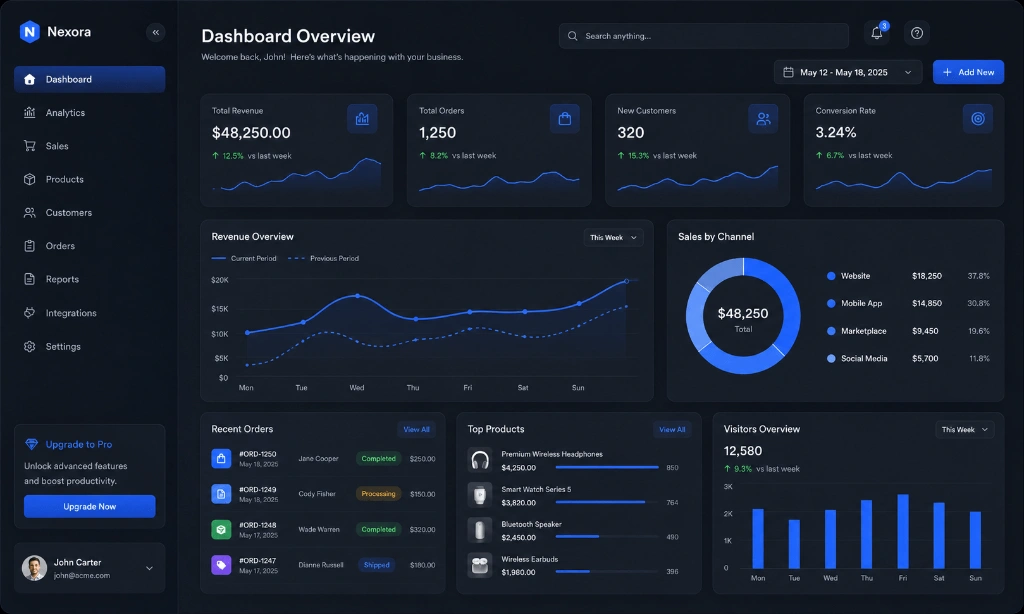
Dark mode isn't supposed to look dull. A single accent color can completely transform the experience.
Popular choices include:
| Accent Color | HEX Code | Recommended Use Case |
|---|---|---|
| Blue | #3B82F6 | Primary action buttons, active navigation, links |
| Emerald | #10B981 | Growth metrics, success badges, financial metrics |
| Purple | #8B5CF6 | AI features, premium upgrades, creative tools |
| Orange | #F97316 | High-energy highlights, warnings, callouts |
The key is consistency. If blue is your primary action color, use it everywhere for primary buttons, links, and active states.
Typography & Contrast Hierarchy #
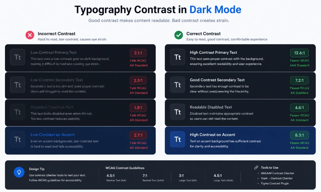
Many designers reduce text brightness too much, causing users to squint after a few minutes.
Instead of using pure white everywhere, create distinct levels of emphasis:
- Primary text → Bright gray (
#F8FAFC) - Secondary text → Medium gray (
#94A3B8) - Disabled text → Soft gray (
#64748B)
Real Products That Do Dark Mode Well #
If you're looking for inspiration, these products consistently deliver excellent dark mode experiences:
- GitHub: Uses soft dark slate grays (
#0d1117) with crisp border outlines. - Notion: Implements clean gray surfaces that make text content extremely easy to read.
- Linear: The gold standard for modern dark UI with subtle gradients and glowing borders.
- Discord: Features distinct dark gray panels (
#313338) that organize complex chat channels smoothly. - Spotify: Uses deep dark grays paired with vibrant emerald green accent buttons.
Notice how each one uses layered surfaces instead of flat black backgrounds.
Common Mistakes to Avoid #
❌ Pure black backgrounds: #000000 causes harsh contrast and eye fatigue.
❌ Neon accent colors everywhere: Overusing oversaturated colors creates visual noise.
❌ Tiny gray text: Over-dimming secondary text makes content unreadable.
❌ No spacing between cards: Lack of margin makes dark interfaces feel cramped.
❌ Inconsistent button colors: Switching action colors breaks mental models.
❌ Poor contrast: Failing WCAG 4.5:1 text contrast rules.
Frequently Asked Questions #
Should I use pure black? #
Usually no. Dark gray backgrounds feel softer, reduce eye strain, and allow elevated cards to stand out with visual depth.
Does dark mode reduce eye strain? #
For many users in low-light environments, dark mode reduces glare and eye fatigue, but readability depends on proper text contrast and typography hierarchy.
Which accent color works best? #
Blue (#3B82F6) is the safest choice because it feels trustworthy and maintains excellent contrast in dark interfaces.
Is dark mode better for OLED displays? #
Yes. Darker pixels reduce energy usage on OLED and AMOLED screens because dark pixels emit significantly less light.
Related Tools #
- Contrast Checker – Verify WCAG 2.1 contrast compliance for dark interfaces.
- Color Palette Generator – Generate harmonized 5-color UI palettes for dark mode.
- Gradient Generator – Create smooth CSS linear and radial gradients.
- Color Picker – Pick dark surface colors and extract HEX, RGB, and HSL tokens.
Related Articles #
- Best UI Color Palettes – Discover 12 modern color combinations for SaaS & mobile apps.
- CSS Color Names – Complete guide to CSS color keywords and values.
- What Is a HEX Color? – Learn how hexadecimal color codes work in CSS.
- HSL vs HSV – Understand hue, saturation, and lightness in modern UI design.
Conclusion #
Dark mode isn't just a visual trend anymore—it's a standard feature users expect from modern digital products.
The best interfaces aren't the darkest ones. They're the ones that make information easy to read, guide users naturally, and maintain a consistent visual language across every screen.
If you're building your own website or app, focus less on making everything black and more on creating depth, contrast, and balance. That's what separates a polished interface from one that simply looks dark.