 ColorHexHub Design Team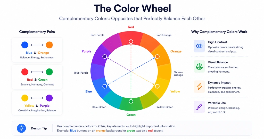
If you've ever looked at a movie poster, a sports team's branding, or even a beautiful sunset and wondered why the colors seem to "pop," there's a good chance complementary colors are doing the heavy lifting.
These aren't random color combinations.
They're based on a simple principle from the color wheel: colors positioned opposite each other naturally create strong visual contrast.
That's why designers, photographers, illustrators, and UI teams rely on them so often.
Used well, complementary colors make important elements stand out. Used poorly, they can make a design feel loud and uncomfortable.
The trick isn't choosing opposite colors—it's knowing how much of each color to use.
What Are Complementary Colors? #
Imagine a traditional color wheel.
Every color has another color directly opposite it.
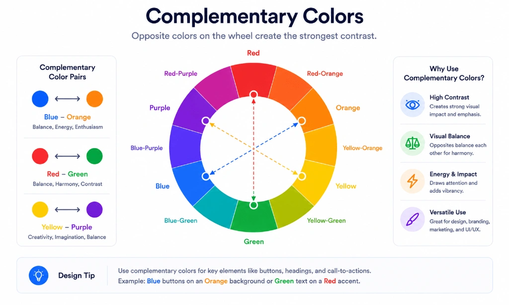
Those opposite pairs are called complementary colors.
Some classic examples include:
| Primary Color | Complementary Partner | HEX Examples | Visual Impact |
|---|---|---|---|
| Blue | Orange | #2563EB ↔ #F97316 | High trust paired with energetic focus |
| Red | Green | #EF4444 ↔ #10B981 | Dynamic urgency paired with growth |
| Yellow | Purple | #F59E0B ↔ #8B5CF6 | Vibrant optimism paired with creative luxury |
When placed next to each other, these colors appear brighter and more vibrant because of their extreme contrast.
Why Designers Love Complementary Colors #
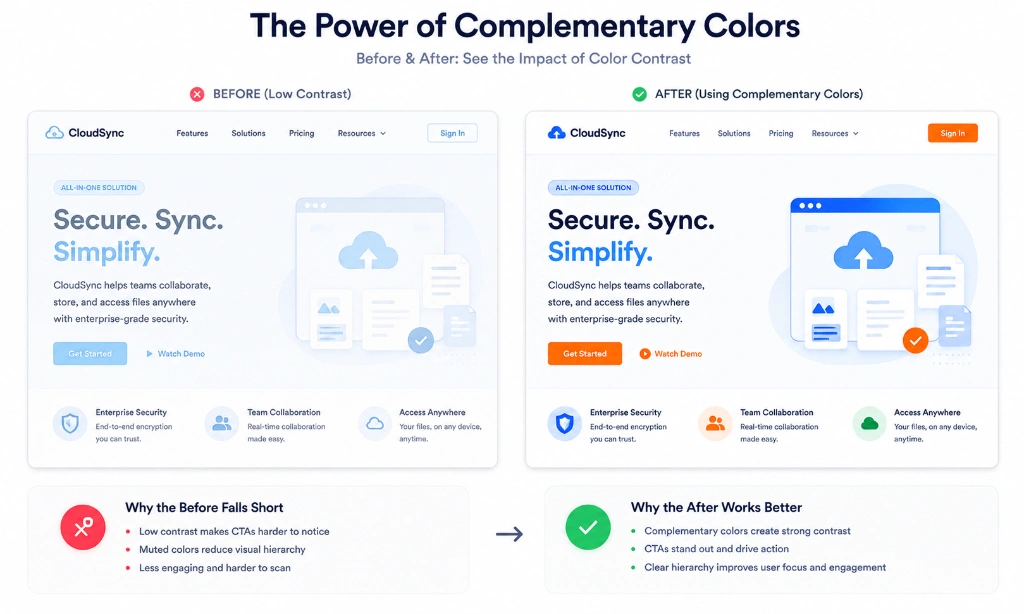
One reason complementary colors work so well is that they naturally guide attention.
Imagine a mostly blue website with a bright orange "Get Started" button.
The button immediately becomes the focal point—not because it's larger, but because it contrasts with everything around it.
That's visual hierarchy in action.
Good design isn't about making everything stand out.
It's about helping the right thing stand out.
Real-World Examples #
You've probably seen complementary colors without realizing it.
A few common examples:
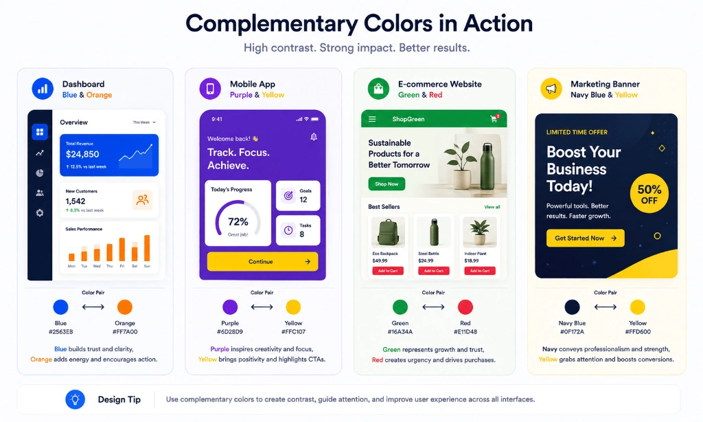
- SaaS Dashboards: A deep blue shopping app using bright orange buttons for promotions and callouts.
- Branding & Sports: Sports teams pairing red uniforms with green accents during championship campaigns.
- Cinema & Photography: Movie posters using teal and orange color grading to separate cool background scenes from warm skin tones.
- Landscape Photography: Capturing a vibrant golden sunset contrasting against a deep indigo sky.
These combinations feel dynamic because human eyes naturally notice high contrast.
Don't Use Equal Amounts of Both Colors #
This is where many beginners go wrong.
If your interface is 50% blue and 50% orange, the design can quickly become overwhelming and vibrate visually.
Instead, think in terms of dominance.
For example:
- Use blue as the primary background and structural color.
- Use orange only for important call-to-action buttons and notifications.
The 80/20 Rule for Color Harmony #
- 80% Dominant Color: Neutral base and primary brand hue.
- 20% Complementary Accent: High-contrast focal points and interactive buttons.
This keeps the interface balanced while still creating enough contrast to drive user engagement.
Where Complementary Colors Work Best #
Complementary color pairs are especially effective for:
- Call-to-Action Buttons: Directing user attention to sign-up or purchase forms.
- Notifications & Badges: Highlighting urgent alerts or active status tags.
- Icons & Micro-interactions: Providing clear visual feedback on click or hover.
- Hero Banners: Making headline copy and key offers pop off the page.
- Data Visualization: Distinguishing contrasting data series in charts and graphs.
For large blocks of body text or full-page backgrounds, softer color relationships like analogous or monochromatic themes often feel more comfortable.
Common Mistakes to Avoid #
- Using both colors at maximum saturation: Creates eye strain and visual noise.
- Ignoring text contrast: Ensure text overlaid on complementary buttons meets WCAG contrast ratios.
- Applying complementary colors to every element: Dilutes visual hierarchy when everything screams for attention.
- Forgetting accessibility testing: Color-blind users may struggle with unassisted red-green pairs.
- Mixing multiple complementary pairs on one screen: Causes chaotic and conflicting focal points.
Tips for Better Results #
- Desaturate one color: Reduce the saturation of the dominant background color while keeping the accent color vibrant.
- Use neutral buffers: Surround complementary pairs with ample white space, light grays, or dark charcoal.
- Tint and shade: Use lighter tints or darker shades of your complementary partner to refine subtle UI hierarchy.
Frequently Asked Questions #
Are complementary colors always opposite each other? #
Yes. On a standard color wheel, complementary colors sit directly opposite each other at 180-degree angles.
Are complementary colors good for websites? #
Yes, especially for CTA buttons, notifications, data charts, and establishing clear visual hierarchy.
Can complementary colors improve accessibility? #
They provide high visual contrast, but you should still verify that text contrast meets WCAG 2.1 standards.
Which complementary pair is most popular? #
Blue and orange are among the most popular combinations in digital UI design because they offer strong contrast without feeling overly aggressive.
Should I use complementary colors everywhere? #
No. They work best when used as targeted accents rather than dominant background colors throughout an interface.
Related Tools #
- Color Wheel – Interactive 12-color wheel with instant complementary pair detection.
- Color Palette Generator – Generate harmonized 5-color complementary palettes.
- Contrast Checker – Verify WCAG 2.1 contrast compliance for complementary pairs.
- Color Picker – Pick colors and calculate exact complementary HEX codes.
Related Articles #
- Color Psychology Explained – Discover how colors shape human emotions and brand perception.
- Best UI Color Palettes – Discover 12 modern color combinations for SaaS & mobile apps.
- Button Color Psychology – Learn how button colors drive user actions.
- What Is a HEX Color? – Learn how 6-digit hexadecimal codes work in CSS.
Conclusion #
Complementary colors are one of the simplest concepts in color theory, but they're also one of the most powerful.
When used with intention, they can make interfaces clearer, marketing visuals more engaging, and brands more memorable.
The key isn't choosing the brightest colors possible. It's finding the right balance between contrast and restraint.
If you start with one dominant color and use its complementary partner only where it matters most, your designs will almost always feel cleaner and more professional.